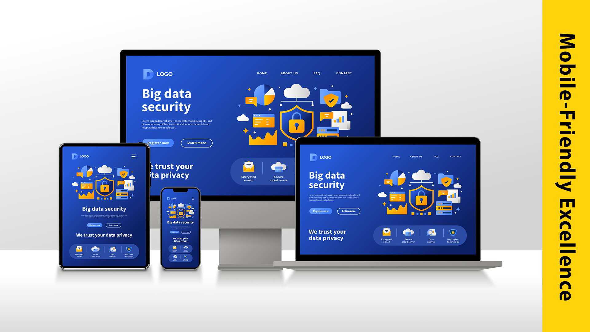
In today’s digital age, where smartphones are an integral part of our lives, having a mobile-friendly design is no longer an option; it’s a necessity. The rise of mobile devices has transformed the way consumers interact with brands and make purchase decisions. To succeed in this mobile-centric landscape and capture consumer loyalty, embracing a mobile-friendly design is paramount.
Understanding the Mobile-First Shift
Consumers are increasingly relying on their mobile devices to access information, shop, and engage with content. Whether it’s researching products, reading reviews, or making online purchases, smartphones have become the go-to platform. As a result, search engines like Google have adapted their algorithms to prioritize mobile-friendly websites in search results. If your website isn’t optimized for mobile, you risk losing valuable visibility and potential customers.
The Impact of Mobile User Experience
Mobile users have high expectations for website performance and user experience. A mobile-friendly design ensures that your website loads quickly, content is easily accessible, and navigation is seamless on smaller screens. When consumers have a positive experience on your site, they are more likely to stay, explore, and convert into loyal customers.
Benefits of Mobile-Friendly Design
Improved Visibility: Mobile-friendly websites rank higher in search engine results pages (SERPs), increasing your online visibility and attracting more organic traffic.
Enhanced User Experience: A responsive design ensures that your website adapts to various screen sizes, providing a consistent and enjoyable experience for users.
Faster Loading Times: Mobile-optimized sites load faster, reducing bounce rates and keeping visitors engaged.
Higher Conversion Rates: A user-friendly mobile design makes it easier for visitors to take desired actions, such as making a purchase or filling out a contact form.
Builds Trust and Credibility: Consumers trust websites that work well on their mobile devices, leading to increased trust in your brand.
Key Mobile-Friendly Design Principles
To capture consumer loyalty through a mobile-friendly design, consider these key principles:
Responsive Design: Ensure your website layout and content adjust gracefully to different screen sizes and orientations.
Mobile-Friendly Navigation: Simplify menus and use mobile-friendly navigation patterns for easy access to information.
Optimized Images and Media: Compress images and use responsive media elements to reduce load times.
Fast Loading: Minimize unnecessary elements and prioritize content to ensure fast loading speeds.
Clear Call-to-Actions (CTAs): Place prominent and easy-to-tap CTAs for a seamless conversion process.
Mobile SEO: Optimize your mobile site for search engines with mobile-focused SEO techniques.
Conclusion
In the competitive digital landscape, capturing consumer loyalty is a top priority for businesses. Embracing a mobile-friendly design is not only essential for SEO but also crucial for providing a positive user experience. By prioritizing mobile optimization, you can enhance your brand’s visibility, credibility, and conversion rates. So, don’t miss out on the opportunity to win the hearts of consumers—embrace mobile-friendly design and secure a loyal customer base for your brand.